PROBLEM
Koinstreet is providing cryptocurrency access to all. They are bridging the knowledge gap needed to invest in cryptocurrency with their mobile app. The company needs an engaging landing page that well articulates it's value, and differentiation from comparable services.
SOLUTION
I designed a high-fidelity landing page that simply articulates the value of Koinstreet, catering to investors of all experiences, especially new investors.
MY ROLE
UX Design - UI Interface
TIMEFRAME
1 week
KEY METHODS & TOOLS
Rapid design sprint, high fidelity prototyping, Adobe XD
________________________________________________
Goals
Koinstreet’s current landing page, although rich with information, could benefit from marketing better detailing the product and it’s features. In this design sprint, I focused brand design components as well as creating a new landing page to provide a finished concept.
Not knowing much about the product, I started to dig into Koinstreet and the competitive landscape.
Research
COMPETITIVE ANALYSIS
One thing that was clear through even a shallow competitive analysis — the cryptocurrency market is saturated, with many of the biggest players also offering educational resources.
Through my research, I noticed many of these competitors' website and apps could be very overwhelming, especially for someone who is brand new to cryptocurrency, or investing in general. It seemed as though competitors assumed a base knowledge level of their users.
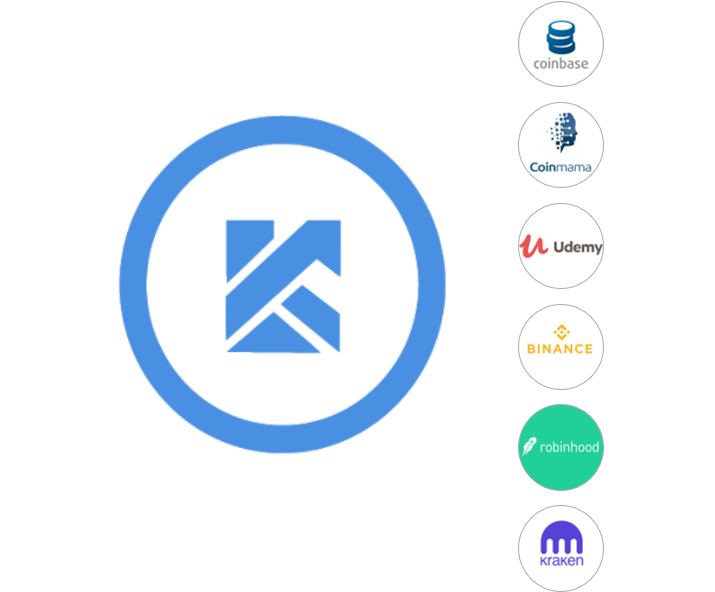
Koinstreet's top competitors.
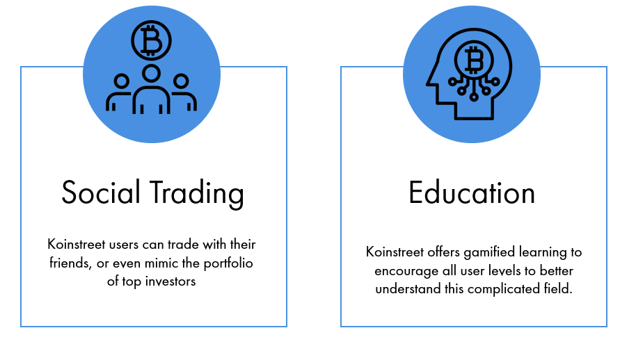
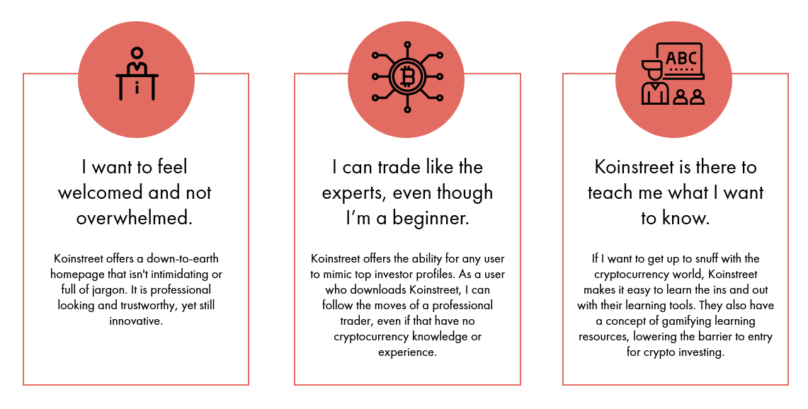
KOINSTREET DIFFERENTIATORS
Now understand the competitive landscape, it was clear that Koinstreet needed to differentiate themselves to find a place in the market. This allowed me to see that Koinstreet is a place for beginners to trade like experts. This is reflected in the following key features:
Understanding the User
It’s important to remember where the user is in their journey not just with Koinstreet, but with cryptocurrency all up. The user is still in the consideration part of their journey, so it is important to clearly communicate the product's value.
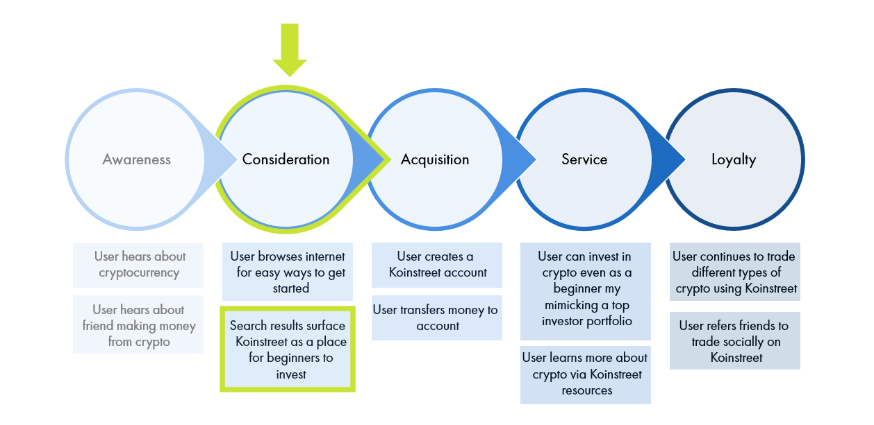
A Koinstreet user's journey with the service.
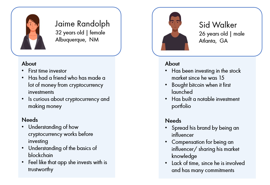
HYPOTHESIS BASED PROTOPERSONAS
Based off my research, I created two protopersonas to reflect the users of Koinstreet. These are the users that would validate branding choices, to ensure that the landing page is effective.
Design
After learning more about the competitors, it was clear that Koinstreet had space to differentiate themselves. This gave me 3 themes for the landing page brand and marketing:
SKETCHING
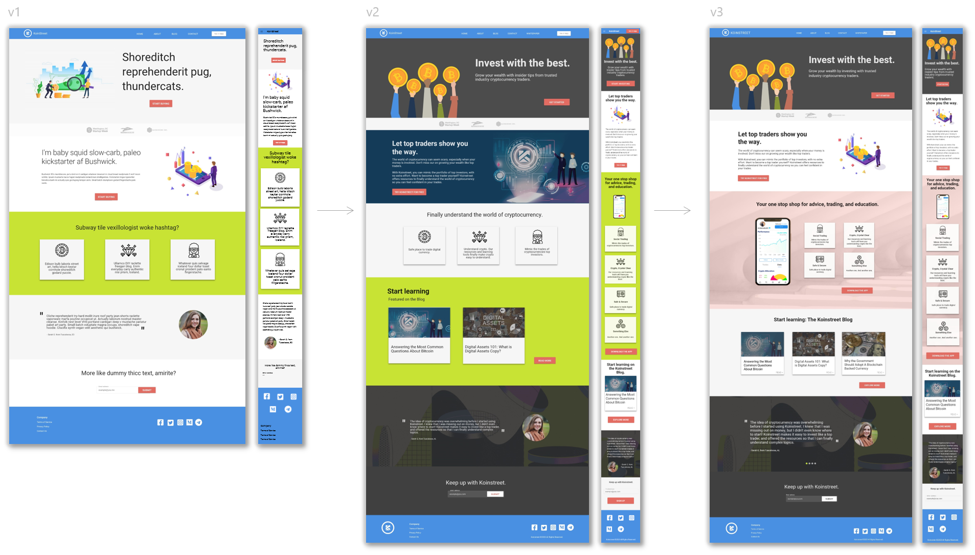
Throughout the sketches and iterations, there was a theme that each landing page was short, simple, and had clear marketing with as little jargon as possible. This ensured that the page would meet all levels of investors where they are.
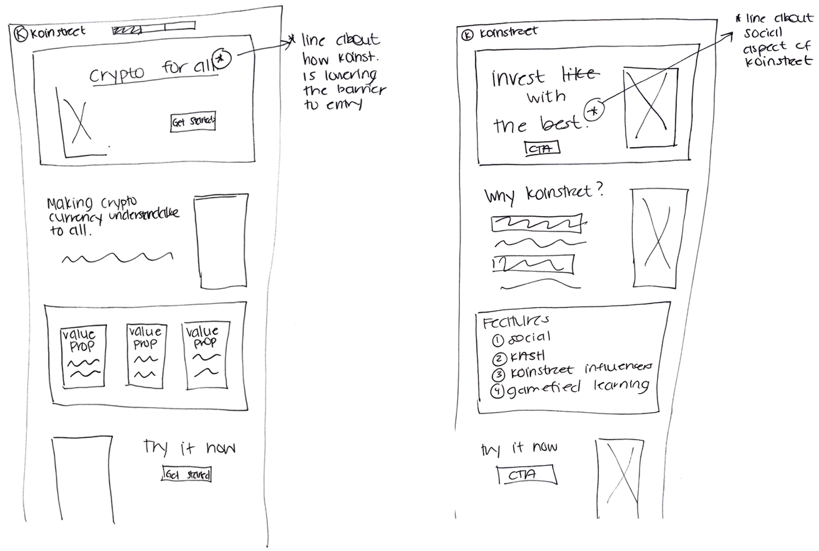
Sketches of Koinstreet landing page.
STYLING AND BRANDING
Moving to the development of visual identity for Koinstreet, it was important to keep their main branding elements the same: namely the blue color as well as the Koinstreet logo.
In order to set a goal for the landing page and aid in the selection of graphics, colors, and typography, I chose some words to describe what I wanted users to feel when viewing the site:
trustworthy. inclusive. innovative.
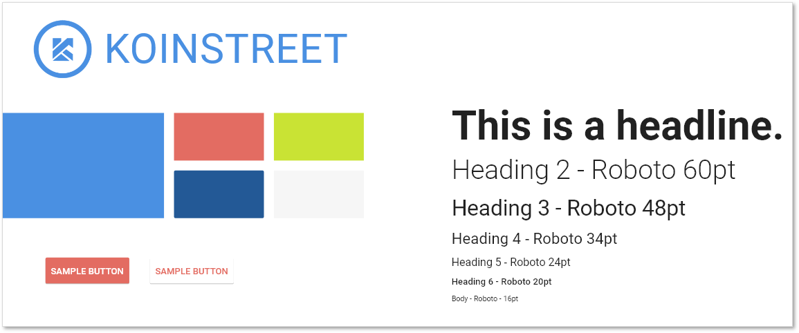
STYLE TILE
Keeping with the Koinstreet blue, I chose triad color palette reflects a trustworthy, yet fun product. I included a green color that is often associate with finance apps, but in a more vibrant and fun value.Overall, I really wanted the page to be seen as "unpretentious", later incorporating the use of illustrations to aid in all users feeling included. For type, I kept it pretty standard by using different type faces of Roboto for all headings, as well as body text.
Prototyping & Iteration
WIREFRAME
A simple baseline wireframe allowed the opportunity to build out the page in terms of content as it was needed to best support the product. This ensured that I was not adding placeholder sections just for the sake of a longer page, only later to lack substantial copy to fill it in.

ADDING FIDELITY
The page design took a couple of twists and turns as it was built out in fidelity and iterated on. There were quite a few sections added to the landing page, making it longer, but allowed for more space to detail Koinstreet’s offerings. This was essential in providing users just enough information about the product, without overwhelming them.
TESTING
Given the time constraints, I limited to conducting 2 rounds of rapid feedback sessions as well as an informal usability interview. This led to a good amount of insights, namely that users were missing key facts about the app itself. Users craved more information about what features Koinstreet offered, even though they were sold on how easy and welcoming the product seemed. This was addressed in my final design.
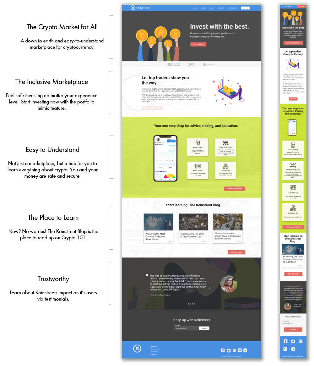
Introducing, Koinstreet.
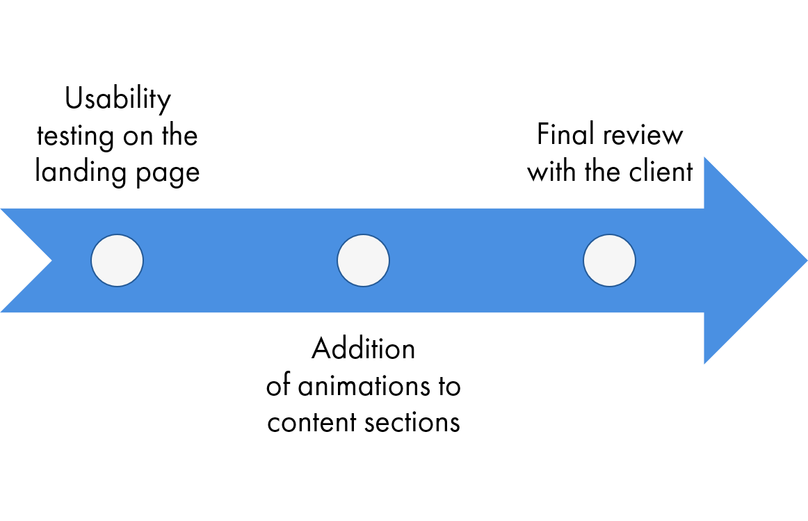
Next Steps
Reflecting back on this work, Koinstreet really has space to move into the cryptocurrency market if they continue to highlight what they do best. To continue this design endeavor, I'd recommend a few things before it's ready for development: